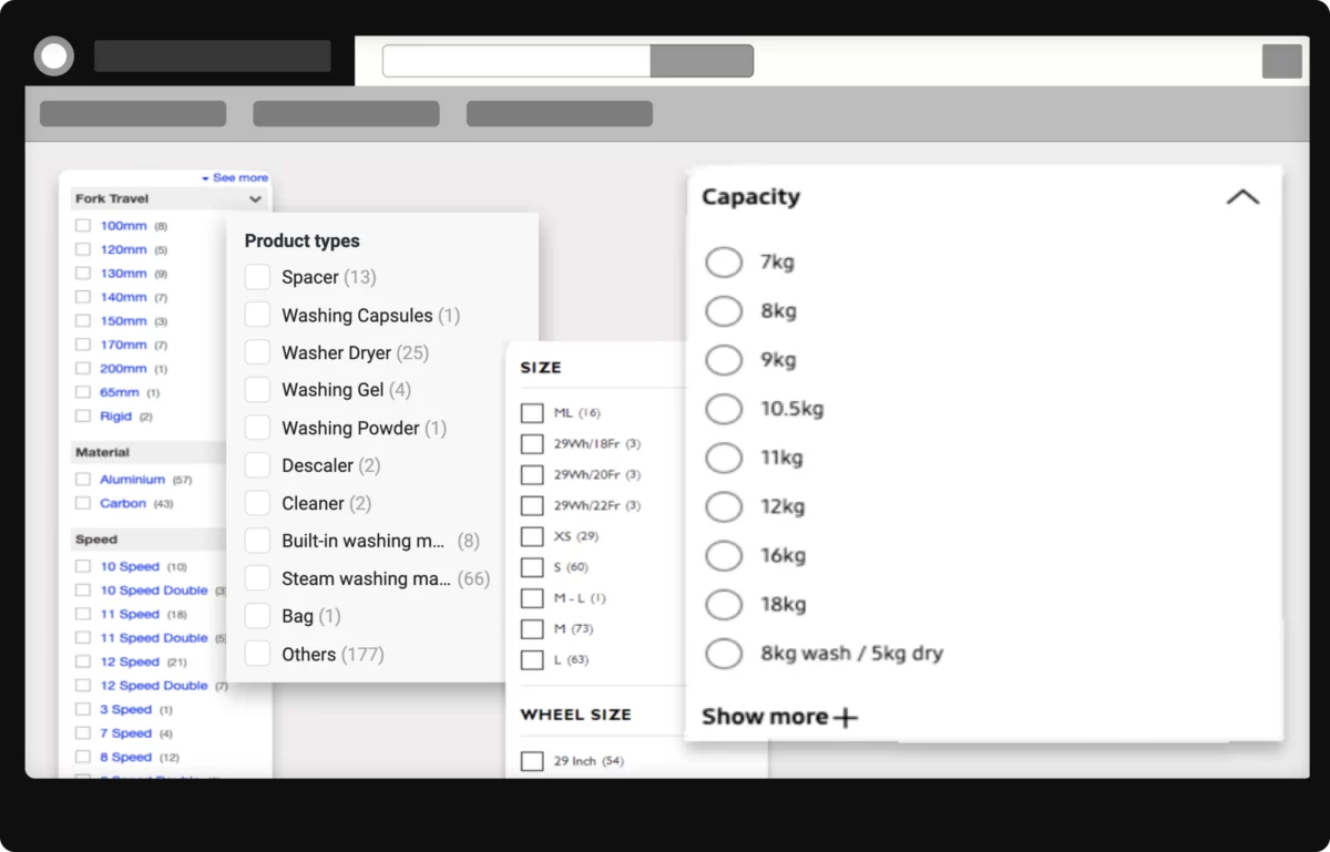
Research from the Baymard Institute reveals 57% of websites have “mediocre” or worse filtering. This often leads users to simply abandon their search and move on! And with their technical jargon and complex categories, filters can make you feel like you need a Ph.D. in whatever you’re buying. In fact, another Baymard Institute study found that a whopping 63% of reviewed websites leave industry-specific filters unexplained.
The Traditional Band-Aid: Static ‘How to Choose’ Pages
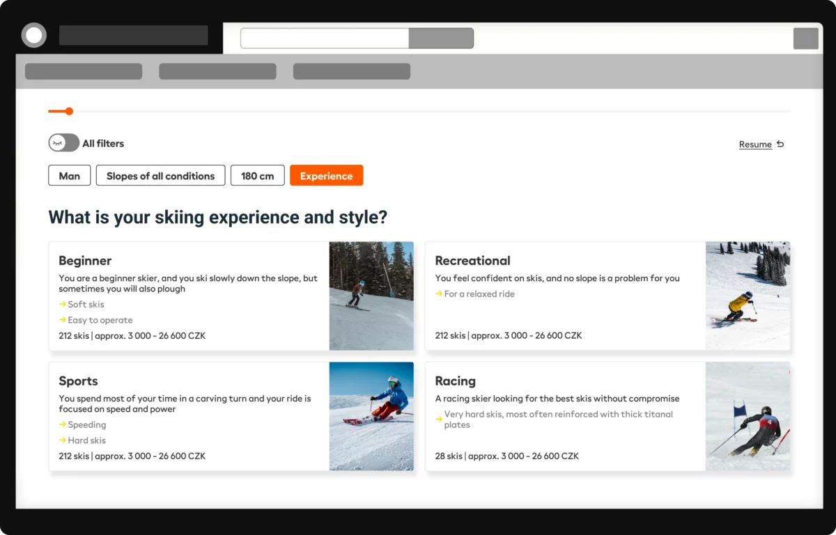
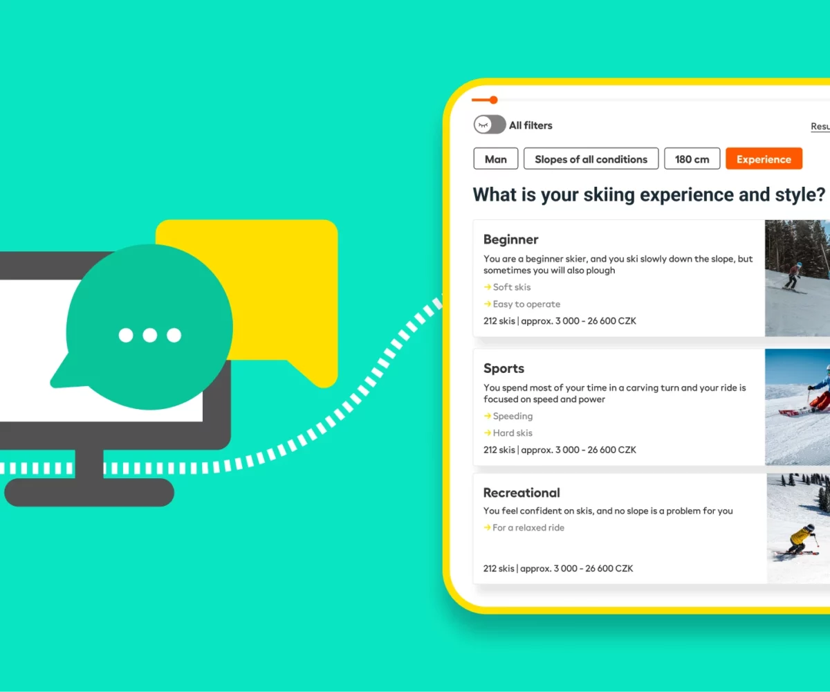
In response to the filter fiasco, many online shops have turned to a seemingly straightforward solution: adding extensive ‘How to Choose’ text pages. While well-intentioned, this approach corresponds to swapping a maze for a mountain of text. Shoppers are forced to leave the product catalog, digest a deluge of information, and then attempt to remember and apply this newfound knowledge as they navigate back to their shopping journey. This process isn’t just tough; it’s a mental marathon for customers. A mountain of text, no matter how well-written, lacks the interactive, personalized touch that modern consumers crave. This method, while it might seem like a step in the right direction, falls short of delivering an efficient and engaging shopping experience.